


Please see Wiki page for other versions
An all-in-one and fully customizable loader/spinner for Angular 5+ and Angular 6+ applications. It supports foreground, background spinner/loader and indicative progress bar.

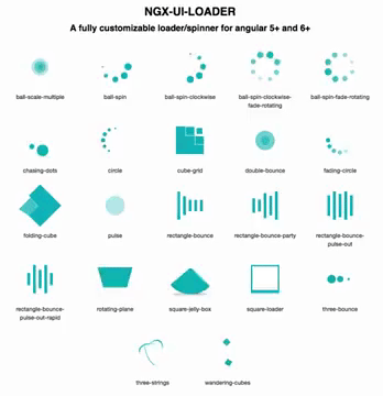
Available spinners:
- Show foreground loader with progress bar
- The page content can be blurred/frosted while showing foreground loader. See NgxUiLoaderBlurred directive for more details
- Show background loader with different id for different tasks
- Be able to add logo, loading text
- Be able to change position of spinners, logo and loading text. NOTE: When they are all set to
center-center, the gap between them are adjusted viagapproperties. Other position types are ignored. E.g. If the position of foreground spinner and logo are set tobottom-center, they will overlap each other. - Be able to change color and size of logo, spinners and progress bar
- Be able to change the direction of progress bar
- Automatically show loader for router events. See NgxUiLoaderRouterModule for more details
- Automatically show loader for http requests. See NgxUiLoaderHttpModule for more details
- Demo
- Getting Started
2.1 Install
2.2 ImportNgxUiLoaderModule
2.3 Includengx-ui-loadercomponent
2.4 UseNgxUiLoaderServiceservice - API - NgxUiLoaderService
- Attributes of NgxUiLoaderComponent
- NgxUiLoaderBlurred directive
5.1 Usage
5.2 Attributes - Custom configuration for NgxUiLoaderModule
6.1 Usage
6.2 Parameters offorRoot()method - Automatically show loader for router events
7.1 Usage
7.2 Parameters offorRoot()method - Automatically show loader for http requests
8.1 Usage
8.2 Parameters offorRoot()method - Changelog
- Credits
- License
Live demo here.
Minimal setup here on stackblitz.
Play with ngx-ui-loader here on stackblitz.
If you like it, please star on Github.
Install ngx-ui-loader via NPM, using the command below.
$ npm install --save ngx-ui-loader$ yarn add ngx-ui-loaderImport the NgxUiLoaderModule in your root application module AppModule:
import { BrowserModule } from  '@angular/platform-browser';
import { NgModule } from  '@angular/core';

import { AppComponent } from './app.component';

import { NgxUiLoaderModule } from  'ngx-ui-loader';

@NgModule({
  declarations: [
    AppComponent,
  ],
  imports: [
    BrowserModule,
    // Import NgxUiLoaderModule
    NgxUiLoaderModule,
  ],
  providers: [],
  bootstrap: [AppComponent]
})
export class AppModule { }After importing the NgxUiLoaderModule, use ngx-ui-loader component in your root app template:
<ngx-ui-loader></ngx-ui-loader>See Attributes of NgxUiLoaderComponent for more details about attributes.
Add NgxUiLoaderService service wherever you want to use the ngx-ui-loader:
import { Component, OnInit } from '@angular/core';
import { NgxUiLoaderService } from 'ngx-ui-loader'; // Import NgxUiLoaderService

@Component({
  selector: 'app-root',
  templateUrl: './app.component.html',
  styleUrls: ['./app.component.scss']
})
export class AppComponent implements OnInit {

  constructor(private ngxService: NgxUiLoaderService) { }

  ngOnInit() {
    this.ngxService.start(); // start foreground loading with 'default' id

    // Stop the foreground loading after 5s
    setTimeout(() => {
      this.ngxService.stop(); // stop foreground loading with 'default' id
    }, 5000);

    // OR
    this.ngxService.startBackground('do-background-things');
    // Do something here...
    this.ngxService.stopBackground('do-background-things');
  }
}
See API - NgxUiLoaderService for more details.
NgxUiLoaderService.start([id]='default')Starts a foreground loader with progress bar. Users cannot interact with the page when the loader is showed.NgxUiLoaderService.stop([id]='default')Stops a foreground loader with progress bar.NgxUiLoaderService.startBackground([id]='default')Starts a background loader. Users can interact with the page when the loader is showed.NgxUiLoaderService.stopBackground([id]='default')Stops a background loader.NgxUiLoaderService.getDefaultConfig()Returns the default configuration object ofngx-ui-loader.NgxUiLoaderService.getStatus()Returns an object includingwaitingForegroundandwaitingBackgroundproperties.NgxUiLoaderService.stopAll()Stops all foreground and background loaders.
You can configure ngx-ui-loader in the template as below:
Import the constant SPINNER from ngx-ui-loader in your controller. Then in your template:
<ngx-ui-loader fgsSize="75" [fgsType]="SPINNER.wanderingCubes"></ngx-ui-loader>All attributes are listed below:
| Attribute | Type | Required | Default | Description |
|---|---|---|---|---|
bgsColor |
string | optional | #00ACC1 |
Background spinner color |
bgsOpacity |
number | optional | 0.5 |
Background spinner opacity |
bgsPosition |
string | optional | bottom-right |
Background spinner postion. All available positions can be accessed via POSITION |
bgsSize |
number | optional | 60 |
Background spinner size. |
bgsType |
string | optional | rectangle-bounce |
Background spinner type. All available types can be accessed via SPINNER |
fgsColor |
string | optional | #00ACC1 |
Foreground spinner color |
fgsPosition |
string | optional | center-center |
Foreground spinner position. All available positions can be accessed via POSITION |
fgsSize |
number | optional | 60 |
Foreground spinner size. |
fgsType |
string | optional | rectangle-bounce |
Foreground spinner type. All available types can be accessed via SPINNER |
logoPosition |
string | optional | center-center |
Logo position. All available positions can be accessed via POSITION |
logoSize |
number | optional | 120 |
Logo size (px) |
logoUrl |
string | optional | (empty string) | Logo url |
pbColor |
string | optional | #00ACC1 |
Progress bar color |
pbDirection |
string | optional | ltr |
Progress bar direction. All directions type can be accessed via PB_DIRECTION |
pbThickness |
number | optional | 3 |
Progress bar thickness |
hasProgressBar |
boolean | optional | true |
Show the progress bar while loading foreground |
text |
string | optional | (empty string) | Loading text |
textColor |
string | optional | #FFFFFF |
Loading text color |
textPosition |
string | optional | center-center |
Loading text position. All available positions can be accessed via POSITION |
gap |
number | optional | 24 |
The gap between logo, foreground spinner and text when their positions are center-center |
overlayColor |
string | optional | rgba(40,40,40,.8) |
Overlay background color |
If you want your page content is blurred/frosted while showing foreground loader, use ngxUiLoaderBlurred directive in your root template as follow:
<div ngxUiLoaderBlurred blur="10">
  <!-- This page content will be blurred/frosted when foreground loader is showed -->
</div>
<ngx-ui-loader></ngx-ui-loader>| Attribute | Type | Required | Default | Description |
|---|---|---|---|---|
blur |
number | optional | 5 |
Blur the page content while showing foreground loader. |
You can override the default configuration via forRoot() method.
import { BrowserModule } from '@angular/platform-browser';
import { NgModule } from '@angular/core';

import { AppComponent } from './app.component';

import { NgxUiLoaderModule, NgxUiLoaderConfig, SPINNER, POSITION, PB_DIRECTION } from 'ngx-ui-loader';

const ngxUiLoaderConfig: NgxUiLoaderConfig = {
  bgsColor: 'red',
  bgsPosition: POSITION.bottomCenter,
  bgsSize: 40,
  bgsType: SPINNER.rectangleBounce,
  pbDirection: PB_DIRECTION.leftToRight, // progress bar direction
  pbThickness: 5, // progress bar thickness
};

@NgModule({
  declarations: [
    AppComponent,
  ],
  imports: [
    BrowserModule,
    // Import NgxUiLoaderModule with custom configuration globally
    NgxUiLoaderModule.forRoot(ngxUiLoaderConfig)
  ],
  providers: [],
  bootstrap: [AppComponent]
})
export class AppModule { }| Parameter | Type | Required | Default | Description |
|---|---|---|---|---|
bgsColor |
string | optional | #00ACC1 |
Background spinner color |
bgsOpacity |
number | optional | 0.5 |
Background spinner opacity |
bgsPosition |
string | optional | bottom-right |
Background spinner postion. All available positions can be accessed via POSITION |
bgsSize |
number | optional | 60 |
Background spinner size. |
bgsType |
string | optional | rectangle-bounce |
Background spinner type. All available types can be accessed via SPINNER |
fgsColor |
string | optional | #00ACC1 |
Foreground spinner color |
fgsPosition |
string | optional | center-center |
Foreground spinner position. All available positions can be accessed via POSITION |
fgsSize |
number | optional | 60 |
Foreground spinner size. |
fgsType |
string | optional | rectangle-bounce |
Foreground spinner type. All available types can be accessed via SPINNER |
logoPosition |
string | optional | center-center |
Logo position. All available positions can be accessed via POSITION |
logoSize |
number | optional | 120 |
Logo size (px) |
logoUrl |
string | optional | (empty string) | Logo url |
pbColor |
string | optional | #00ACC1 |
Progress bar color |
pbDirection |
string | optional | ltr |
Progress bar direction. All directions type can be accessed via PB_DIRECTION |
pbThickness |
number | optional | 3 |
Progress bar thickness |
hasProgressBar |
boolean | optional | true |
Show the progress bar while loading foreground |
text |
string | optional | (empty string) | Loading text |
textColor |
string | optional | #FFFFFF |
Loading text color |
textPosition |
string | optional | center-center |
Loading text position. All available positions can be accessed via POSITION |
blur |
number | optional | 5 |
Blur the page content while showing foreground loader. Only applied when using ngxUiLoaderBlurred directive. |
gap |
number | optional | 24 |
The gap between logo, foreground spinner and text when their positions are center-center |
overlayColor |
string | optional | rgba(40,40,40,.8) |
Overlay background color |
threshold |
number | optional | 500 |
The time a loader must be showed at least before it can be stopped. It must be >= 1 millisecond. |
If you want the loader to start automatically for navigating between your app routes, in your root AppModule, do as follow:
import { BrowserModule } from  '@angular/platform-browser';
import { NgModule } from  '@angular/core';

import { AppComponent } from './app.component';

import { NgxUiLoaderModule, NgxUiLoaderRouterModule } from  'ngx-ui-loader';

@NgModule({
  declarations: [
    AppComponent,
  ],
  imports: [
    BrowserModule,
    NgxUiLoaderModule, // import NgxUiLoaderModule
    NgxUiLoaderRouterModule, // import NgxUiLoaderRouterModule. By default, it will show foreground loader.
    // If you need to show background spinner, do as follow:
    // NgxUiLoaderRouterModule.forRoot({ showForeground: false })
  ],
  providers: [],
  bootstrap: [AppComponent]
})
export class AppModule { }| Parameter | Type | Required | Default | Description |
|---|---|---|---|---|
showForeground |
boolean | optional | true |
If true, foreground loader is showed. Otherwise, background loader is showed. |
If you want the loader to start automatically for http requests, in your root AppModule, do as follow:
import { BrowserModule } from  '@angular/platform-browser';
import { NgModule } from  '@angular/core';
import { HttpClientModule } from '@angular/common/http';

import { AppComponent } from './app.component';

import { NgxUiLoaderModule, NgxUiLoaderHttpModule } from  'ngx-ui-loader';

@NgModule({
  declarations: [
    AppComponent,
  ],
  imports: [
    BrowserModule,
    HttpClientModule, // import HttpClientModule
    NgxUiLoaderModule, // import NgxUiLoaderModule
    NgxUiLoaderHttpModule, // import NgxUiLoaderHttpModule. By default, it will show background loader.
    // If you need to show foreground spinner, do as follow:
    // NgxUiLoaderHttpModule.forRoot({ showForeground: true })
  ],
  providers: [],
  bootstrap: [AppComponent]
})
export class AppModule { }
If you wish to not show loader for some specific API urls, you can pass an array of these urls (case-insensitive) to forRoot() method as below:
NgxUiLoaderHttpModule.forRoot({ exclude: ['/api/not/show/loader', '/api/logout'] });or if you don't want to show loader for urls which start with /api/auth, do as follow:
NgxUiLoaderHttpModule.forRoot({ exclude: ['/api/auth'] });| Parameter | Type | Required | Default | Description |
|---|---|---|---|---|
exclude |
string[] | optional | null |
An array of API urls. The loader is not showed when making request to these API urls. |
showForeground |
boolean | optional | false |
If true, foreground loader is showed. Otherwise, background loader is showed. |
v.1.2.5
- Be able to hide progress bar
v.1.2.0
- Add NgxUiLoaderBlurred directive for blurring the page content while the foreground loading is showed. See NgxUiLoaderBlurred
NGX_POSITIONSis deprecated. UsePOSITIONinsteadPB_DIRECTIONSis deprecated. UsePB_DIRECTIONinsteadSPINNER_TYPESis deprecated. UseSPINNERinstead
v.1.1.8
- Http interceptor - Can configure to not show loader for some API urls
- Npm packages - version bump
v.1.1.5
- Be able to show loader automatically for http requests - Http interceptor
v.1.1.2
- Add more spinner types (total 22 spinners)
- BugFix: Background spinner (if active) should be showed after the foreground spinner is closed out
v.1.1.1
- Bugs fixed
v.1.1.0
- Show loader automatically when navigating between app routes
- Add more spinner types
- Be able to set a threshold
- BugFix: Set z-index of background spinner to 99997
v.1.0.2
- Update example app and README
v.1.0.1
- BugFix: Position of background spinner is not fixed when scrolling
- BugFix: Unsafe Base64 logo url
- BugFix: Logo, foreground spinner and loading text are centered correctly and can set the gap between them via gap input
v.1.0.0
- Show foreground loader with progress bar
- Show background loader with different id for different tasks
- There are 12 spinner types available
- Be able to add logo, loading text
- Be able to change position of spinners, logo and loading text
- Be able to change color and size of spinners and progress bar
- Be able to change the direction of progress bar
- Tobias Ahlin - CSS spinkit
- Daniel Cardoso - Load awesome
- Matt Carter - AngularJS
angular-ui-loader
MIT © t-ho
Permission is hereby granted, free of charge, to any person obtaining a copy of this software and associated documentation files (the "Software"), to deal in the Software without restriction, including without limitation the rights to use, copy, modify, merge, publish, distribute, sublicense, and/or sell copies of the Software, and to permit persons to whom the Software is furnished to do so, subject to the following conditions:
The above copyright notice and this permission notice shall be included in all copies or substantial portions of the Software.
THE SOFTWARE IS PROVIDED "AS IS", WITHOUT WARRANTY OF ANY KIND, EXPRESS OR IMPLIED, INCLUDING BUT NOT LIMITED TO THE WARRANTIES OF MERCHANTABILITY, FITNESS FOR A PARTICULAR PURPOSE AND NONINFRINGEMENT. IN NO EVENT SHALL THE AUTHORS OR COPYRIGHT HOLDERS BE LIABLE FOR ANY CLAIM, DAMAGES OR OTHER LIABILITY, WHETHER IN AN ACTION OF CONTRACT, TORT OR OTHERWISE, ARISING FROM, OUT OF OR IN CONNECTION WITH THE SOFTWARE OR THE USE OR OTHER DEALINGS IN THE SOFTWARE.