To add text labels to the plot, use the label parameter of the following methods:
-
title()to add a title on the top of the active plot. -
xlabel()to add the x axes labels: its parameterxsideis used to address a specificxaxis,lowerorupper, in short1or2. -
Analogously
ylabel()to add the y axes labels: itsysideparameter is used to address a specificyaxis ,leftorright, in short1or2. -
The axes labels will all appear at the bottom of the plot, with the exception of the upper
xaxis label, which will appear on the top center of the plot, moving the plot title to the top left, if present. -
To change the labels colors and styles, use the functions
ticks_colors()andticks_style(), as explained in this and this section respectively.
Here are the main functions used to alter the plot lines:
-
xaxes(lower, upper)to set whatever or not to show the x axes; it accepts two Boolean inputs, one for eachxaxis. -
yaxes(left, right)to set whatever or not to show the y axes; it accepts two Boolean inputs, one for eachyaxis. -
To control all axes simultaneously, use the function
frame()instead, which will show or remove the plot frame (composed of all 4 axes) with a single Boolean. -
The
grid()method is used to add or remove thehorizontalandverticalgrid lines and requires two Boolean inputs. These lines are anchored to the axes numerical ticks. -
To add extra lines at some specific coordinates use the functions
vertical_line()andhorizontal_line(), as explained in this section.
To specify which marker to use to plot the data points, use the parameter marker, available for most plotting functions; for example: scatter(data, marker = "x").
This parameter accepts the following:
-
A single character; if the space character, the plot will be invisible.
-
A list of specific markers, one for each data point: its length will automatically adapt to the data set.
-
One of the following marker codes which will translate in the marker specified (some may not be available in Windows):
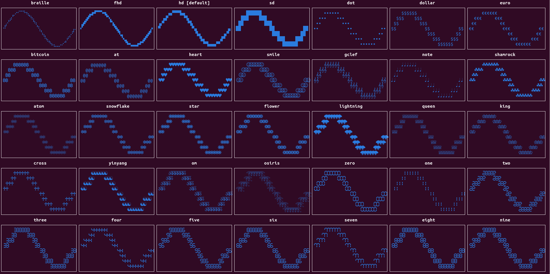
-
sdstands for standard definition. -
hdstands for high definition and uses the 2 x 2 Unicode block characters (such as ▞). -
fhdstands for full high definition and uses the 3 x 2 Unicode block characters (such as 🬗). This marker works only in Unix systems and only in some terminals. -
brailleuses the 4 x 2 Unicode braille characters (such as ⢕). This marker should works in Unix systems (tested only in few terminals).
-
-
It is possible to have markers of different resolutions in the same canvas, but it is recommended not to mix them when in the same signal using line plots, while it is safe to mix them with a normal scatter plot.
-
Access the
markers()method for the available marker codes.
Colors could be applied to the data markers using the color parameter, available to most plotting functions.
Colors could easily be applied to the rest of the plot, using the color parameter of the following methods:
-
canvas_color()to set the background color of the plot canvas alone (the area where the data is plotted). -
axes_color()to sets the background color of the axes, axes numerical ticks, axes labels and plot title. -
ticks_color()sets the (full-ground) color of the axes ticks, the grid lines, title, and legend labels, if present.
Here are the types of color codes that could be provided to the color parameter, as well as the fullground or background parameters of the colorize() method, described here:
-
the following color string codes, where
defaultwill use the default terminal color: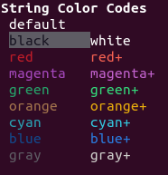
-
An integer between 0 and 255, where the first 16 integer color codes produce the same results as the previous string color codes:
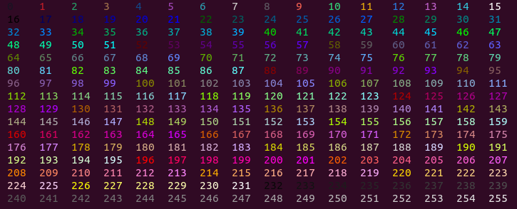
-
An RGB color consisting of a tuple of three values (red, green, blue), each between 0 and 255, to obtain the most realistic color rendering.
-
A list of color codes to give a different color to each data point marker: each color could be of a different kind (string, integer or rgb) and, if of lower length, the list of colors will adapt to the data set, by repetition.
-
Access the function
colors()for the available string and integer color codes.
Styles could be applied to the data markers using the style parameter, available to most plotting function, including colorize(), described here.
Styles could easily applied to the rest of the plot, using the style parameter of the ticks_style() method, which is used to set the style of the axes ticks, title, and legend labels, if present.
These are the available style codes that could be provided to the style parameter.
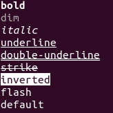
-
Any combination of styles could be used at the same time, provided they are separated by a space.
-
Using
flashwill result in an actual white flashing marker. -
Access the function
styles()for the available style codes.
To quickly chose a favorite color and style combination, for the entire figure or one of its subplots, use the theme() method.
The available themes could be displayed with the function themes(); here is its output:
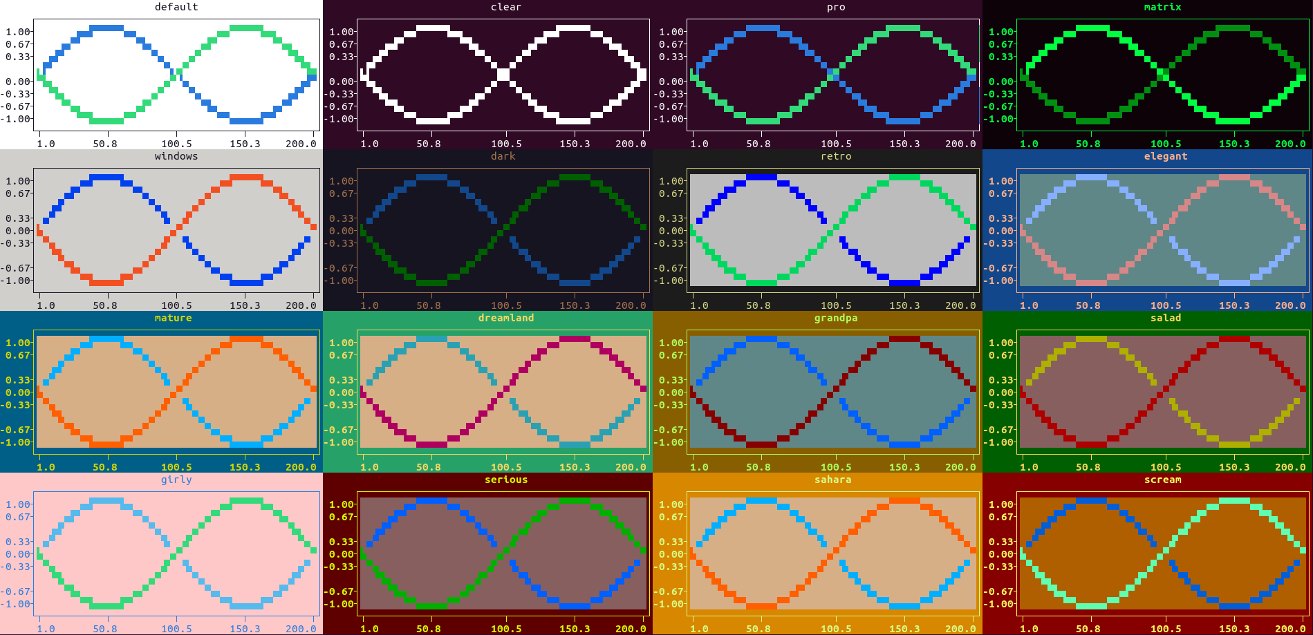
-
To remove all plot colors and styles from the current subplot, use the function
clear_color(), in shortclc(), which is equivalent totheme('clear'). -
To add, tweak, rename any theme presented, please feel free to open an issue, dropping your favorite combination (canvas, axes, ticks color and style, and 3 signals in sequence).