Provide a guide that has discrete colors, but labels shifted between them to highlight intervals #2673
Comments
|
Can you clarify whether merely the guide should be discrete while the scale itself is continuous such as in your lattice example, or if it is intended for discrete scales? It is possible to write your own guides - ggraph does so - so it is not necessary that this has to be put into ggplot2 proper, but could also reside in an extension package. If @hadley don’t want it in ggplot2 you’re welcome to open an issue in ggforce |
|
Thanks for the reply. I think this should be implemented for discrete data, for continuous data imho it is factually incorrect to have a scale that does not represent all the colors in the plot. Sorry if that example was a bit misleading. |
|
I think the exact desired behavior needs to be thought through more carefully. It seems to me that what is wanted is a function that takes a continuous range, splits it into bins, and then colors the data points within each bin uniformly. To do this properly, you'd need both a new scale and an accompanying guide. If it's just about using discrete colors for already discrete data, I don't see why the existing |
|
Not knowing the internal design of |
|
I generally think there is a case to be made for a |
|
I think this would be fine in ggplot2 |
|
Ok - I’ll look into it after this release |
|
Awesome, thanks! |
|
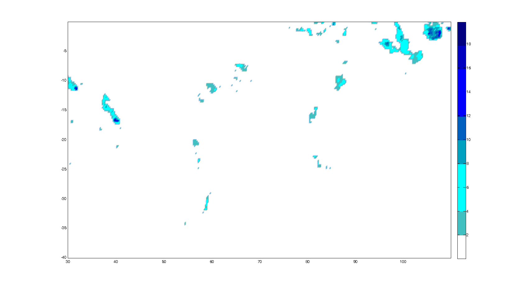
Hi all, I would very much welcome the feature proposed by Adriano. Atmospheric and earth scientists tend to discretise continuous variables for a more readable plot display. I built a framework to plot meteorological variables on a map. Currently, I use Adriano's workaround to produce an appropriate scale. I added two plots to illustrate how useful such a feature is. The plots are based on ggplot (plus: geom_quiver, geom_polypath and a set of functions to produce (filled/labelled) contours with holes)
Best regards, Matt |


|
@m-saenger those are some awesome plots. Would you be able to share the source code? |
|
@adrfantini Thanks. Will do so. Need to tidy up things first. |
|
FWIW vega calls these discrete gradient scales. |
|
And the simplest way to implement them is to write a palette function that discretizes the colors and then draw the tick marks at the bin boundaries. This approach can reuse nearly all of the existing functionality of continuous color scales. (That's how I did the discrete value-suppressing scales.) |
|
Example: library(ggplot2)
discrete_gradient_pal <- function(colours, bins = 5) {
ramp <- scales::colour_ramp(colours)
function(x) {
if (length(x) == 0) return(character())
i <- floor(x * bins)
i <- ifelse(i > bins-1, bins-1, i)
ramp(i/(bins-1))
}
}
scale_colour_discrete_gradient <- function(..., colours, bins = 5, na.value = "grey50", guide = "colourbar", aesthetics = "colour", colors) {
colours <- if (missing(colours))
colors
else colours
continuous_scale(
aesthetics,
"discrete_gradient",
discrete_gradient_pal(colours, bins),
na.value = na.value,
guide = guide,
...
)
}
ggplot(mtcars, aes(disp, hp, colour = mpg)) +
geom_point() +
scale_colour_discrete_gradient(
colours = viridisLite::viridis(5, begin = 0.2, end = 0.9),
limits = c(10, 35),
breaks = 5*(2:7),
guide = guide_colourbar(nbin = 100, raster = FALSE, frame.colour = "black", ticks.colour = NA)
)Created on 2018-07-05 by the reprex package (v0.2.0). |

|
Nice! We should definitely try and get that into 3.1. |
|
I think we should aim a bit higher and provide a ScaleBin class at the same level as ScaleContinuous and ScaleDiscrete. There are other areas than colour where binning might make sense, even with positional scales, so I think this should have deep support |
|
@clauswilke , is there any WIP code we can look at / test out? |
|
I thought I provided that in my comment from July 5. |
|
Whoopsie. I thought that required some development |
|
We don't have a pending PR if that's the question. I was just demonstrating that a basic implementation can be done easily with existing functionality. |
|
I still want to do something at a fundamental level for this when I get the time |
|
@thomasp85 have you managed to take a look at this? I cannot code, but I am more than willing to help with testing if that can be of any use. |
|
By the way, the awesome package metR includes a |

|
Note that the herein discussed discrete color bar would still not give the requested result from this SO question - which is the varying interval widths represented in the discrete guide. It would be nice if an implementation of a discrete color bar would also allow for that |
|
should this issue now be closed, considering the functionality from For future readers, have also a look at this SO post which shows how to extend the small colorbar ticks to full separators |
|
Yep, I think it can be closed indeed. |
This is a feature request.
ggplot2does not provide a way to use discrete color scales in which the labels are staggered compared to the colors. In my opinion, this kind of color bars is more intuitive than color bars where each color is assigned an explicit interval (usually in a form like[2,5)).Using only base
ggplot, this is the best that I could come up with (SO question link), but it's very hackish, involving shifting the labels and using a dummy empty label at the end:While this works, it is a bit hackish, the labels often are a bit shifted depending on plot size, and the white spaces between the color boxes do not look very good.
Most other plotting systems allow for this kind of color bar: here are some examples of the kind of color bar that I'd like in
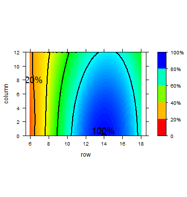
ggplot, implemented in other plotting systems:Lattice (source):
Base graphics (source):

Matplotlib (source):
MATLAB (source):
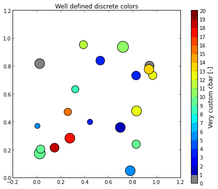
I have written a small function (SO link with examples) to be able to plot this kind of color bar as a
ggplotobject, to be added to other objects usingpatchworkor similar. It's not a great solution however: a built-in guide would be much much better.Example result:
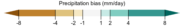
Note that in this case the last "bin" in the color bar indicates that the last color represents values going up to infinity; this is a useful feature in many cases.
Could something like this be implemented as a built-in guide?
The text was updated successfully, but these errors were encountered: