First Things to Know:
-
The plot dimensions by default adapt to the terminal size but can be changed using the
plotsize()method described here. -
To plot a matrix of subplots, use the
subplots()andsubplot()methods, described in this section. -
The
markerparameter of most plotting functions can be used to change the marker character used to plot the data, as described in this section. High definition"hd"and"fhd"markers are available, including"braille". -
Similarly the
colorparameter is used to define the color of the data points, as described in this section. -
To rapidly generate some test sinusoidal or a square wave data, use respectively the
sin()orsquare()methods, described here. -
To add labels to the plot use the
title(),xlabel(), andylabel()methods, described here, as well as thelabelparameter of most plotting functions to add an entry to the plot legend. -
To change the plot colors and ticks style, use the
axes_color(),canvas_color(),ticks_color(),ticks_style()methods, described here, or more directly using thetheme()method, described here. -
To add lines to the plot, use the
grid(),horizontal_line()orvertical_line()methods, described here. -
To add or remove the axes use the methods
xaxes(),yaxes()or directlyframe(), described here. -
To change the axes numerical ticks use the functions
xfrequency(),xticks(),yfrequency()andyticks(), described here. -
As with
matplotlib, the plot is only displayed when theshow()method is finally called. -
To display the plot dynamically - without using
show()- use theinteractive(True)method, as described here. -
To finally save the plot use the function
savefig(path)described here. -
To clear the figure, data or color settings, use the
clear_figure(),clear_data()orclear_color()methods respectively, described here. -
To clear the screen, before or after plotting, use the
clear_terminal()method, described here. -
The documentation of all
plotextmethods and plotting functions is available in itsdoccontainer, as described here. -
The package is under development, so any bug report or feature request is very welcomed, just by opening an issue.
Here is a simple scatter plot:
import plotext as plt
y = plt.sin() # sinusoidal test signal
plt.scatter(y)
plt.title("Scatter Plot") # to apply a title
plt.show() # to finally plot
or directly on terminal:
python3 -c "import plotext as plt; y = plt.sin(); plt.scatter(y); plt.title('Scatter Plot'); plt.show()"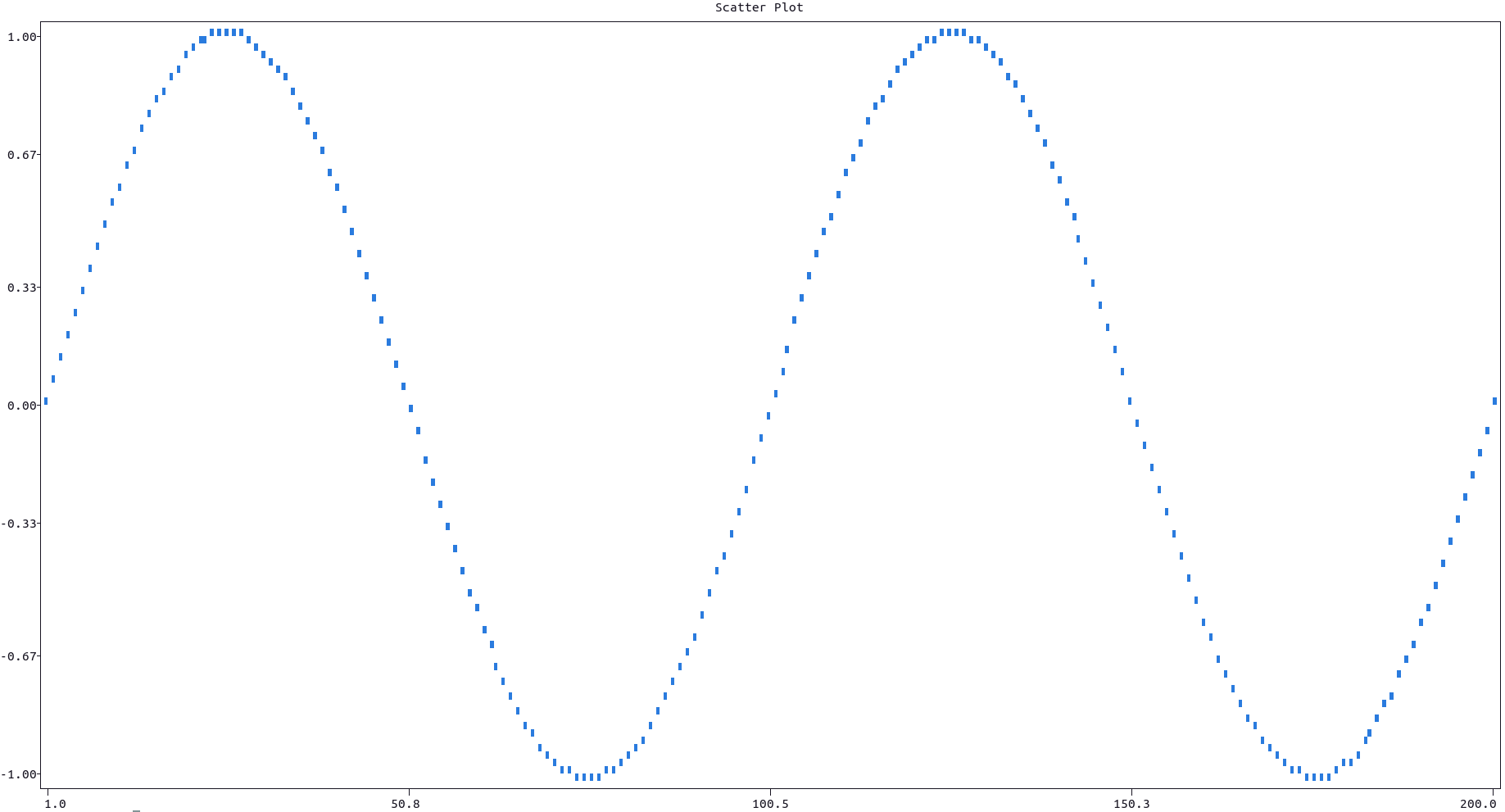
More documentation can be accessed with doc.scatter().
For a line plot use the plot() function instead:
import plotext as plt
y = plt.sin()
plt.plot(y)
plt.title("Line Plot")
plt.show()
or directly on terminal:
python3 -c "import plotext as plt; y = plt.sin(); plt.plot(y); plt.title('Line Plot'); plt.show()"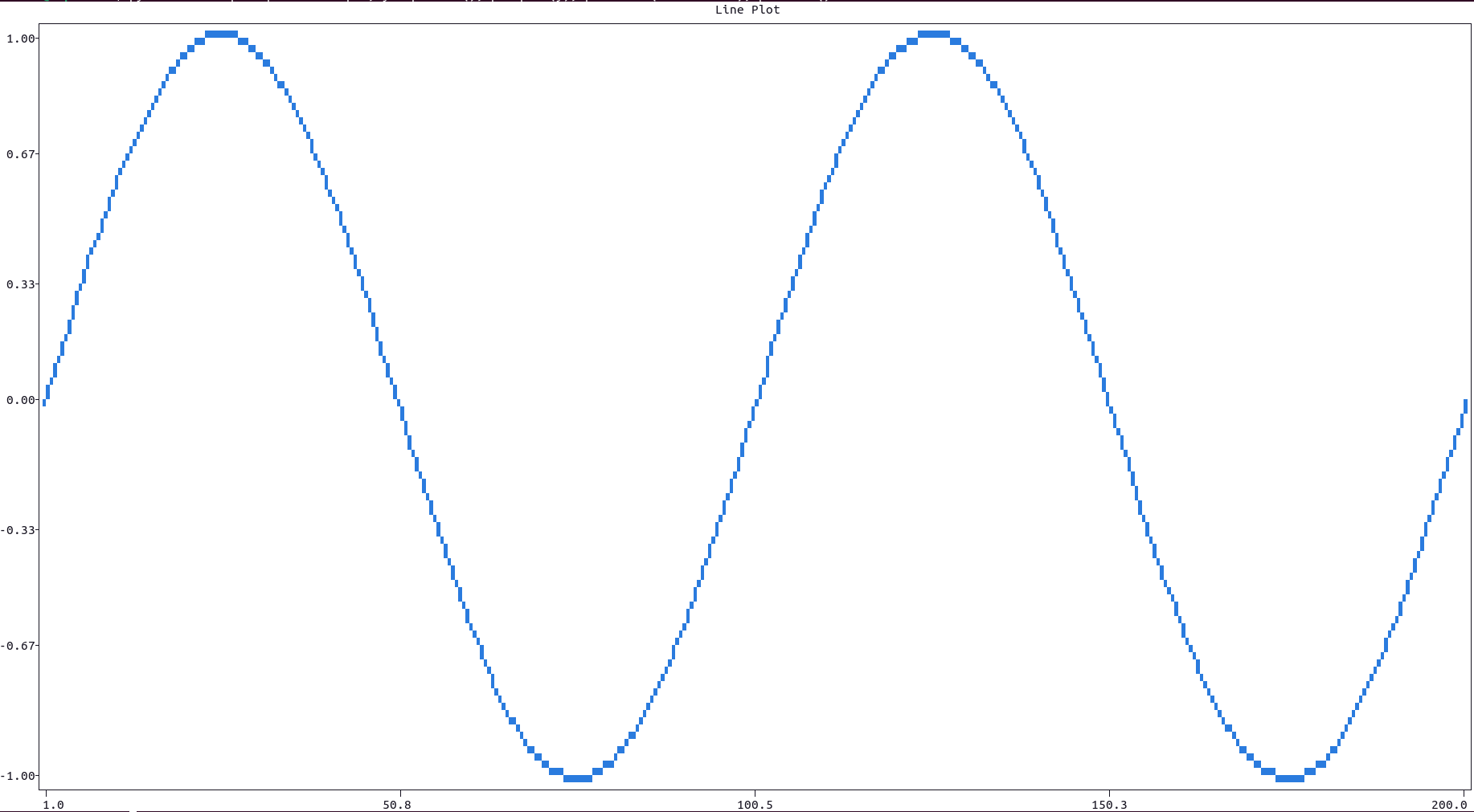
More documentation can be accessed with doc.plot().
For a logarithmic plot use the the xscale("log") or yscale("log") methods:
xscale()accepts the parameterxsideto independently set the scale on eachxaxis ,"lower"or"upper"(in short1or2).- Analogously
yscale()accepts the parameterysideto independently set the scale on eachyaxis ,"left"or"right"(in short1or2). - The log function used is
math.log10.
Here is an example:
import plotext as plt

l = 10 ** 4
y = plt.sin(periods = 2, length = l)

plt.plot(y)

plt.xscale("log")    # for logarithmic x scale
plt.yscale("linear") # for linear y scale
plt.grid(0, 1)       # to add vertical grid lines

plt.title("Logarithmic Plot")
plt.xlabel("logarithmic scale")
plt.ylabel("linear scale")

plt.show()
or directly on terminal:
python3 -c "import plotext as plt; l = 10 ** 4; y = plt.sin(periods = 2, length = l); plt.plot(y); plt.xscale('log'); plt.yscale('linear'); plt.grid(0, 1); plt.title('Logarithmic Plot'); plt.xlabel('logarithmic scale'); plt.ylabel('linear scale'); plt.show();"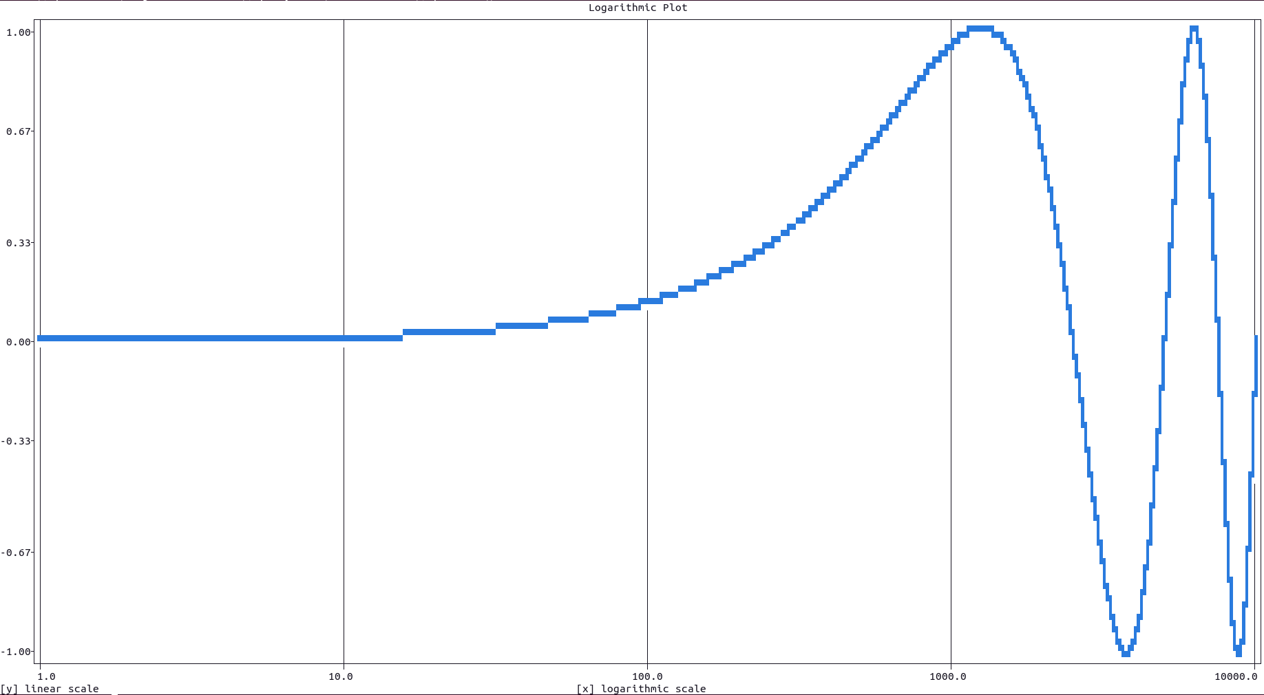
More documentation is available with doc.xscale() or doc.yscale() .
For a stem plot use either the fillx or filly parameters (available for most plotting functions), in order to fill the canvas with data points till the y = 0 or x = 0 level, respectively.
If a numerical value is passed to the fillx or filly parameters, it is intended as the y or x level respectively, where the filling should stop. If the string value "internal" is passed instead, the filling will stop when another data point is reached respectively vertically or horizontally (if it exists).
Here is an example:
import plotext as plt
y = plt.sin()
plt.plot(y, fillx = True)
plt.title("Stem Plot")
plt.show()
or directly on terminal:
python3 -c "import plotext as plt; y = plt.sin(); plt.plot(y, fillx = True); plt.title('Stem Plot'); plt.show()"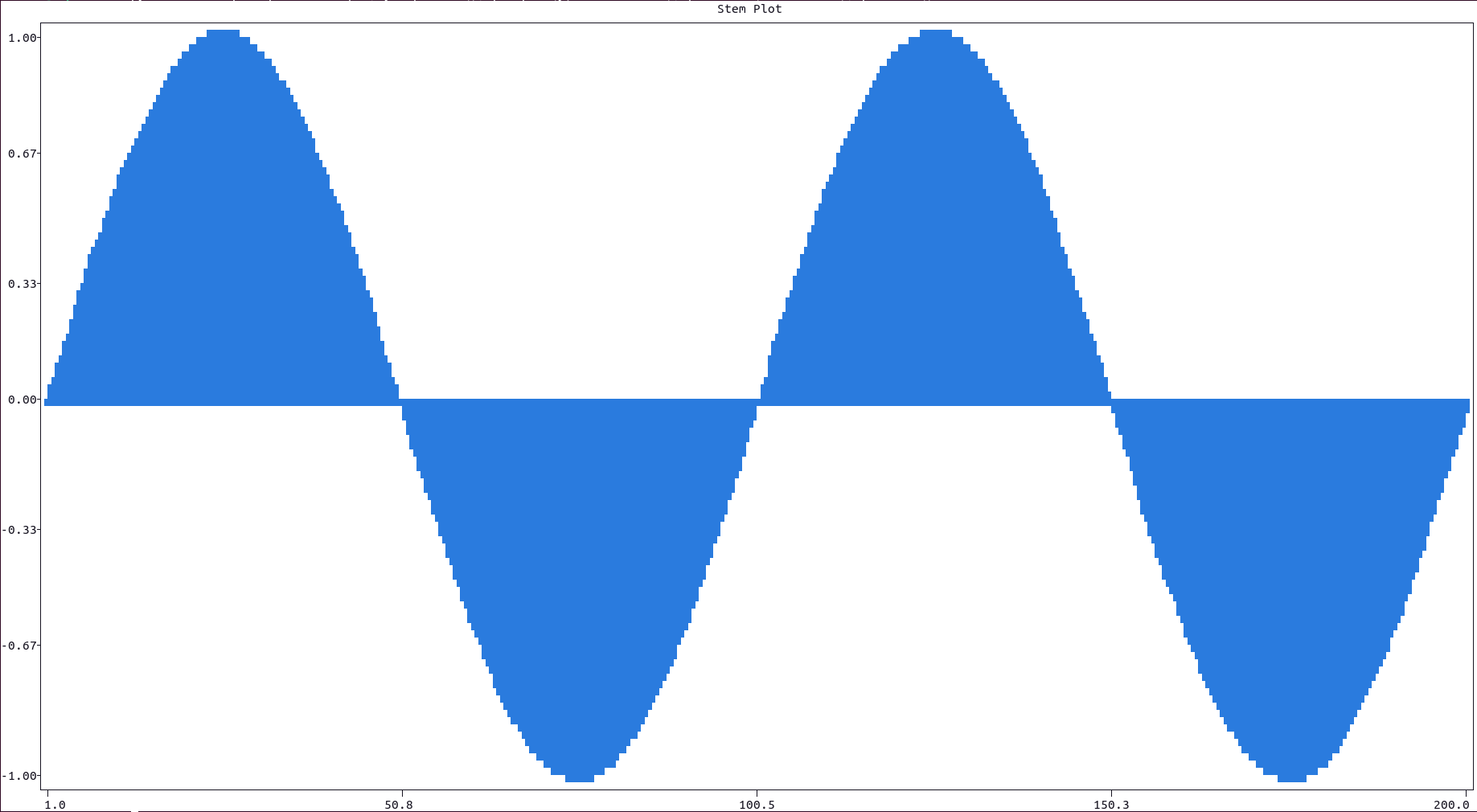
Multiple data sets can be plotted using consecutive plotting functions. The label parameter, available in most plotting function, is used to add an entry in the plot legend, shown in the upper left corner of the plot canvas.
Here is an example:
import plotext as plt

y1 = plt.sin()
y2 = plt.sin(phase = -1)

plt.plot(y1, label = "plot")
plt.scatter(y2, label = "scatter")

plt.title("Multiple Data Set")
plt.show()
or directly on terminal:
python3 -c "import plotext as plt; y1 = plt.sin(); y2 = plt.sin(phase = -1); plt.plot(y1, label = 'plot'); plt.scatter(y2, label = 'scatter'); plt.title('Multiple Data Set'); plt.show()"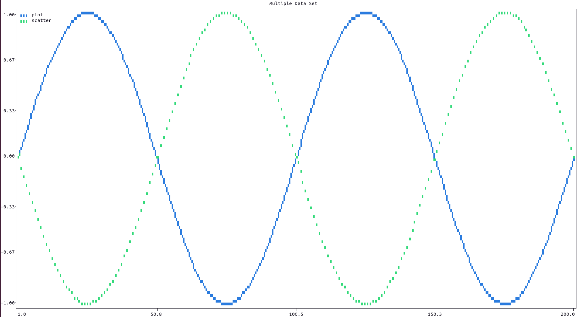
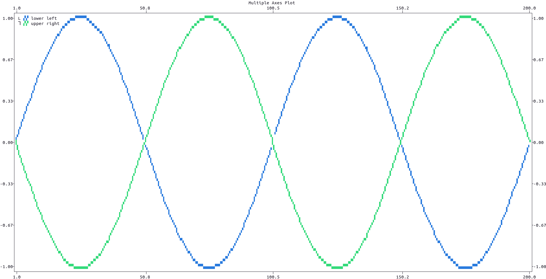
Data could be plotted on the lower or upper x axis, as well as on the left or right y axis, using respectively the xside and yside parameters of most plotting functions.
On the left side of each legend entry, a symbol is introduce to easily identify on which couple of axes the data has been plotted to: its interpretation should be intuitive.
Here is an example:
import plotext as plt

y1 = plt.sin()
y2 = plt.sin(2, phase = -1)

plt.plot(y1, xside = "lower", yside = "left", label = "lower left")
plt.plot(y2, xside = "upper", yside = "right", label = "upper right")

plt.title("Multiple Axes Plot")
plt.show()
or directly on terminal:
python3 -c "import plotext as plt; y1 = plt.sin(); y2 = plt.sin(2, phase = -1); plt.plot(y1, xside = 'lower', yside = 'left', label = 'lower left'); plt.plot(y2, xside = 'upper', yside = 'right', label = 'upper right'); plt.title('Multiple Axes Plot'); plt.show()"